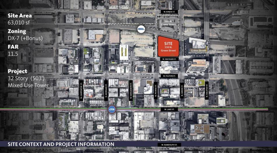
The Committee on Design has reviewed the redesigned proposal at 330 N. Green. Originally revealed first by Urbanize at the end of September 2022, Sterling Bay’s project will occupy a full block site that is bound by the Metra tracks to the north, N. Green St to the east, W. Wayman St to the south, and N. Peoria St to the west. The new building will stand across from Sterling Bay’s 333 N. Green and currently under construction 360 N. Green.
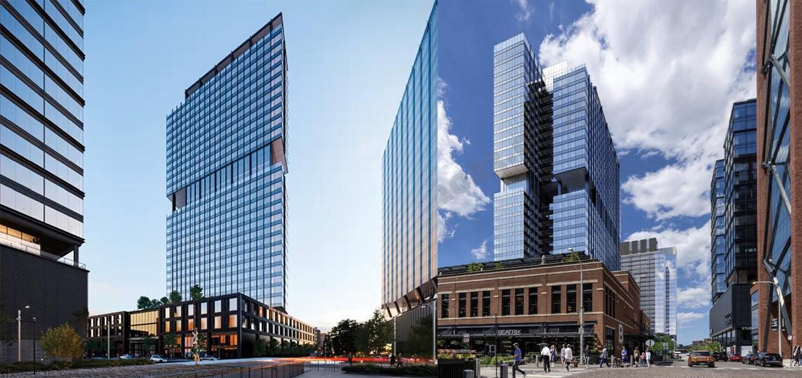
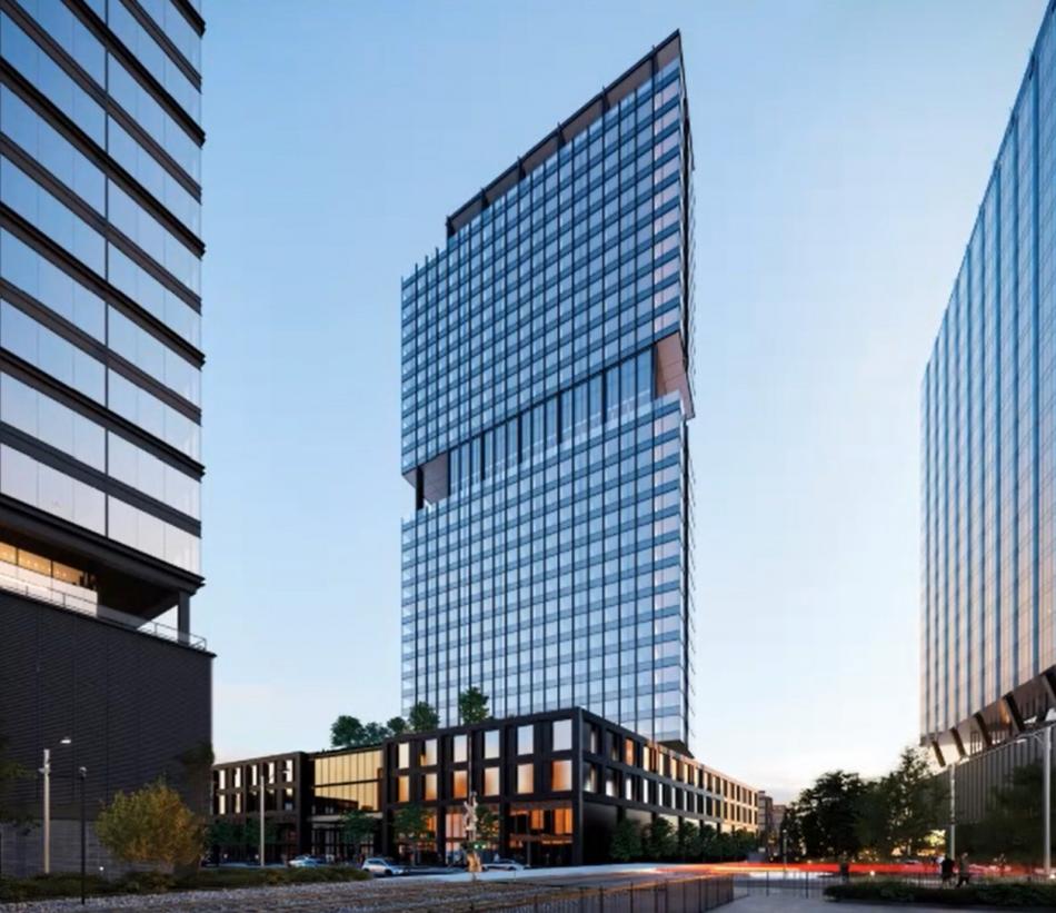
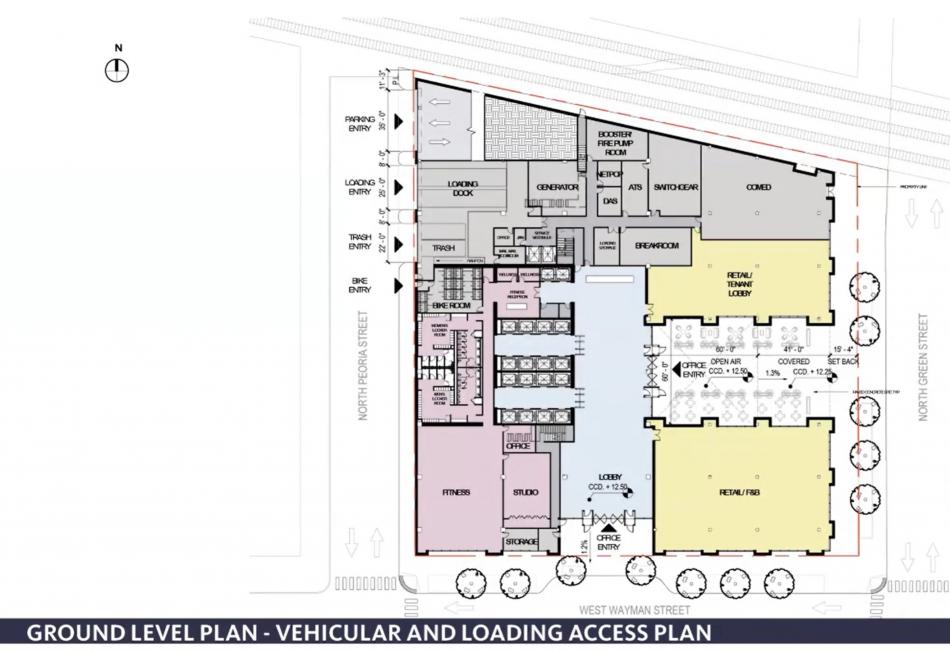
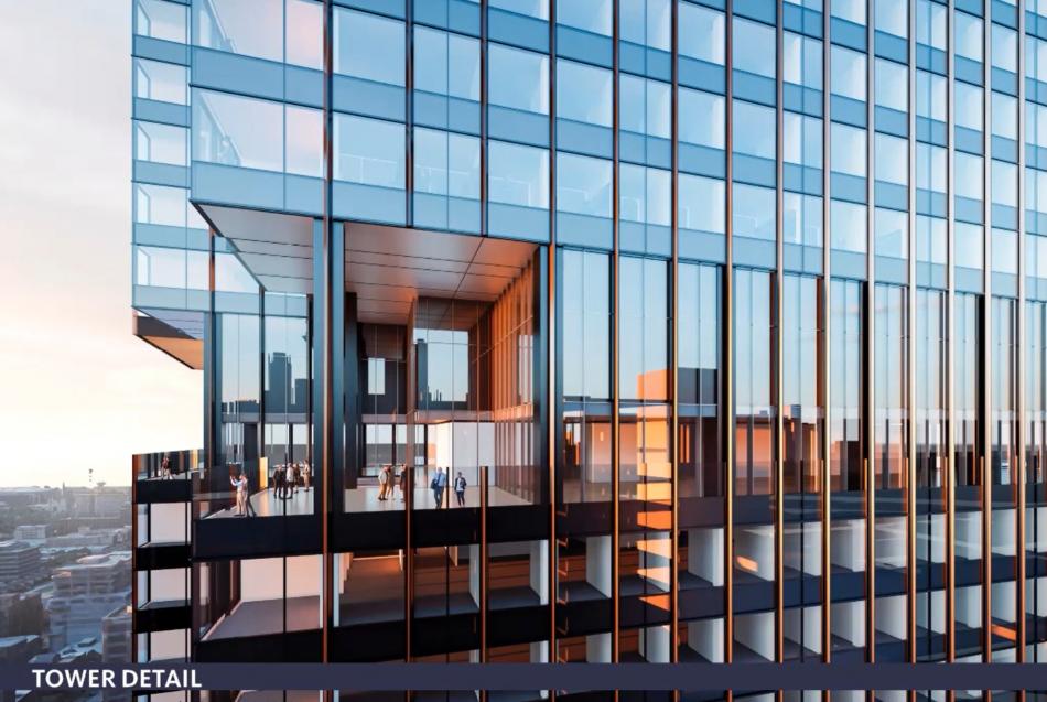
Previously an 18-story office building dubbed The Porch, the new design will replace the bulky SOM design with a more slender, glassy tower by Gensler. Set to rise 503 feet, the 32-story mixed-use building will offer 683,000 square feet of office space, as well as 13,650 square feet of ground floor retail space. 207 parking spaces will be included in the podium, with 2,500 square feet of open space planned.
The design is based on the ideas of providing a vibrant public realm, maximizing light and air, and providing an efficient, tenant-driven floor plate. With market conditions for professional services firms calling for less interior floorplate space, the tower has been designed as two thin office blocks attached to the structural core. The tower has been pushed all the way to the west side of the site to create an urban room of space along N. Green St and allow for the preservation of southern views from the 360 N. Green tower.
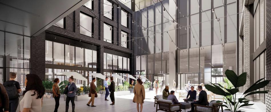
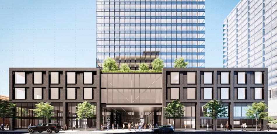
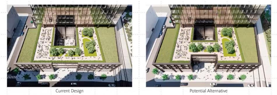
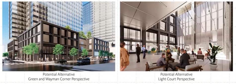
At the ground, the podium stands three floors, with the upper two floors holding the parking spaces. With a deep footprint for getting to the building lobby, the ground floor has been carved with an outdoor space that is linked to the sky through an internal light court. This courtyard space creates a unique area for potential food and beverage vendors that could be retail tenants.
The discussion opened with Leon Walker, who zeroed in on the podium’s light court and the bridge of parking over the opening. Walker asked how this bridge helps the design and commented that it doesn’t appear to help make the project more pedestrian-friendly. The design team responded that the opening underneath the bridge is quite generous, measuring 22 feet high and 60 feet wide. They expressed that they felt the opening’s proportion is hospitable for people to come in and that with active food and beverage retailers this could become a very inviting, active public space.
Jeanne Gang chimed in next to say that she liked the new tower massing better, but questioned how welcoming the ground floor open space would be to the public and questioned the setback of the building of N. Green St. The design team responded that the setback along N. Green St is in response to concerns of pedestrian congestion on the sidewalk, giving some relief to that public avenue while also helping announce it as the main entryway.
Maria Villalobos spoke next, offering the idea of consolidating the retail space to the north side and opening up the southeastern corner to create an open space that is open to the sky and full of greenery accessible to the public. The design team pushed back on the concept, citing concerns of causing lots of complications including the loss of a dynamic corner retail space, an issue of organizing all of the support spaces, and the complication of the parking layout above.
Jackie Koo added her thoughts next, questioning how the tower’s facade could be differentiated to respond to the solar conditions as well as wondering if there was a way to bring the tower massing down to the ground. Koo also felt that the open space didn’t feel truly public with the large bridge enclosing that access point from above. The design team pointed out that the tower does align vertically with the W. Wayman St entrance but has a setback on the amenity level separating them visually. The design team explained how they also considered eliminating the bridge but cannot lose any more parking and have looked at an alternate option that sets back the bridge from the street.
Philip Enquist chimed in with an appreciation of their efforts to get to a more vibrant public realm, but questioned if the open-air atrium was large enough. Enquist pushed further, questioning the true need for 12 parking spaces and said that if they could eliminate the bridge that the courtyard would be so much better. The team responded that in conversations with their leasing team, their opinion was that the currently provided parking count is right on the edge of being enough and cannot afford to lose those spaces. Enquist followed up with the comment that people in the meeting’s chat were referencing similar projects with much less parking and challenged the entire development team to reconsider the need of those spaces in the effort to improve the public courtyard space.
Eleanor Gorski jumped in right at the end, suggesting that the removal of the bridge and removing those 12 spaces may be a nice compromise in improving the public space if they wouldn’t be able to do something more drastic like Villalobos’s ideas, citing the fact that the committee has expressed their preference for the removal of the bridge.
With these comments in hand, the design team and DPD will continue their conversations through the approval process and some design changes will be likely. To allow for this new design, the project’s Planned Development will need to be amended, requiring approvals from the Chicago Plan Commission, Committee on Zoning, and City Council.


